Olive
A simple yet functional wellness app which focuses on healthy habits and improves one’s overall mood through guided meditations, mindful music, and dynamic fitness routines.
Role: UX/UI Designer
Tools: Adobe XD, Figma
Skills: Wireframing, Prototyping, User Interviews, User Research, Affinity Mapping, Usability Testing, Surveys, A/B Testing
Duration: 7 months
PROBLEM STATEMENT:
Our health-conscious individuals need a way to review their personal habits and stay motivated to workout because they want to improve the overall clarity of their lives.
DESIGN THINKING PROCESS
THE WHY BEHIND OLIVE
Due to stress and anxiety from the global pandemic and the rise of mental health awareness, it is key to bring forth a solution to combat these feelings. Individuals need to discover ways to incorporate balance into their daily routine. The accessibility of workout routines, health tips, and guided meditations will allow potential users to gain confidence and take the necessary steps toward a happier and healthier version of themselves.
EXECUTIVE SUMMARY
The goal is to provide a digital outlet where users can sufficiently gain access to health and wellness information while also staying on the same page with potential stakeholders and designers.
TARGET AUDIENCE
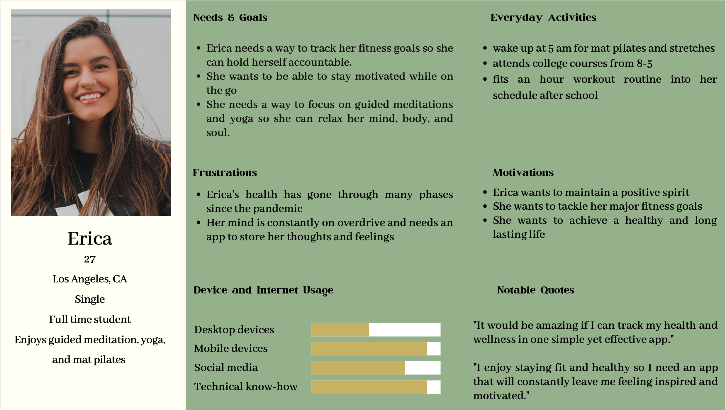
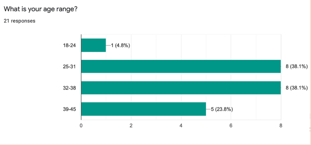
The target age demographic for this app consists of young adults between the ages of 18-35. This group is most likely active on their mobile devices and are more prone to seeing the value of a health and wellness app.
RESEARCH
To test the functionality of the Olive app, I conducted a survey, 3 user interviews, and usability tests. From the results of the user research, I quickly discovered that some of the features needed a mini makeover. Although some users expressed that the app was simple and easy to use, Olive still needed some TLC in order to provide a better solution and also maintain the health and fitness aspect.
“Health and fitness mean everything to me. They should become a top priority for others as well.”
I created a survey using Google Forms and received responses from 21 individuals. The majority expressed that they enjoy working out and use apps to keep track of their health and wellness.
Affinity mapping was also utilized after conducting user interviews. There were mixed results when it came to utilizing personal health and wellness into daily lifestyles. Through these interviews, I was able to get a better sense of direction for features on the Olive app.
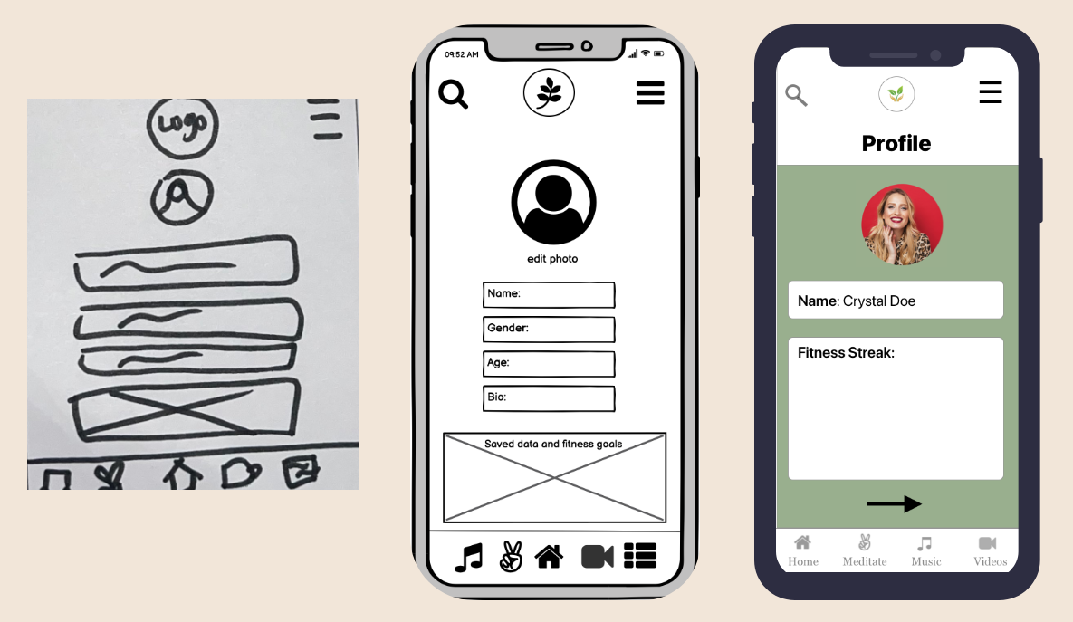
The results were then used to ideate ideas for the features and functions of the app through low, mid-fidelity, and high-fidelity wireframes.
MUSIC
Kept the Olive logo above and center
Included a colored background
Kept songs, sounds, and playlists images uniform with grid sizes in mind
PROFILE
Changed the layout from mid-fidelity to high-fidelity by removing gender, age, and bio
Kept the profile section simple and straight to the point
USABILITY TESTING
6 participants were involved in the mobile usability test for the Olive app. Errors, observations, negative quotes, and positive quotes were expressed in the process and were then transferred to a Rainbow Spreadsheet for comparison.
Many findings and user interviews later, I went back to the drawing board and polished the UI in order to enhance the features of Olive. Users were not a huge fan of the peach background, so I opted for a green earthy tone in order to showcase the true meaning and intention behind this health and wellness app. I also increased the onboarding button sizes, fonts for readability, and swapped out images for a clearer layout.
OLIVE PROTOTYPE
REFLECTIONS
Overall, I managed to design an app that represents a calm and soothing vibe. I also incorporated the suggestions of my user interviews based on their feedback. If I were to switch up the layouts, I would include more intriguing icons and illustrations. I would also attempt to create my own illustrations and typography.


